Recently we were given the opportunity to ask Taylor Fischer of Firaxis some questions. Taylor is an artist who has worked on Civilization 5 and its expansions, and now Beyond Earth and Rising Tide. Before joining Firaxis, Taylor worked on Elder Scrolls Online and Kingdoms of Amalur: Reckoning. She was also a voice actress in Dishonored. You can find her art tumblr here.
 What is the process for getting a piece of work from your head into the game, and what tools do you use in that process?


Concepting begins with the game designer and their idea for the game. The designer will come to the artists and give us a rundown on how the unit, building or idea works in the game and any other thoughts or background info they have. The concept artist will generate some different approaches and create a visual language for the piece. Depending on the project, there can be between one and thirty different takes on the concept. We, (the artists) have a saying: First take is worst take. and this means that usually you have to dig a bit to get the underlying idea expressed correctly. The final iteration is typically a blend of a few of the early approaches.
As far as tools go, 90% of what I use is Adobe Photoshop. The modelers and animators tend to use 3DStudio Max and Maya for most of their work.
What kind of direction do you get from the design team when setting out to create art for Civ games, and how much freedom are you given within the creative process?
At Firaxis, we get a lot of creative freedom from our designers. Part of whats so great working here is that the team trusts the artists to take their ideas and inject their creativity and personality. Generally, the only time theyll reign us in is when the artist has missed their idea for how something functions in the game. This happens less often than you might think.
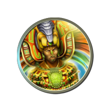
For Civ5, there is a wealth of material to draw on when creating modern leaders such as Gandhi. However, there are fewer representations of others leaders such as Pacal or Dido. What source material did you rely on when designing this latter type of Civ5 leader?

Civ fans tend to be history buffs, so theyre aware that theres a lot of written reference in historical text and ancient art. Ive also use a college professor as a reference, since he has a background in ancient cultures. Hell give me advice on what someone might have worn during a given time period. I also love visiting museums, so if I have to go look up something specific at a museum or exhibit, Im happy to do that, too.
With the growing popularity of the Civ5 modding scene, many people have tried to emulate your art style in producing their own art for their mods. Do you have any thoughts on the art you've seen, and do you have any advice for modders on how to replicate the style in their own work, or techniques which you have used in producing the Civ5 maps?
I think our fans are doing a great job in the map style for their mods, and I think theyve got the general approach to the style down well. Id like to encourage modders to take ownership and feel free to do a map in a style that they think looks cool, and not worry about having to copy the games style, too closely. Thats a way to put your own stamp on your work. Do what you like doing.
Since the release of Civ5, the community has uncovered several pieces of art which were completed but never made it into the final game, including wonder splashes and icons. How much art hit the cutting room floor?
Wow, so much art hits the floor! In terms of all the work we do in concept, almost 90% of what we make never goes into the game. Theres a lot of iteration. Some ideas get saved and re-used later. Some ideas are cool ideas, but not the right idea for the game.
Civ5 and Beyond Earth have very different art styles from each other, with the former being heavily influenced by Art Deco and the latter a more unique style. How were these art styles decided on, and was it always set to be what we see now or were there other ideas originally?
I was an intern at Firaxis during the development of Civ V, and that UI style was established early on with the Art Deco style. With Beyond Earth being the next chapter in Civilization the team wanted to differentiate the UI styles but make it somewhat familiar. The style they chose is a blend of a variety of sci-fi themes.
What were some of the major influences in conceptualising the art for Beyond Earth? Particularly, did any sci-fi material have a special influence on the art style?
A little bit of everything went into the mix. There wasnt an overriding influence from any one particular source. There are nods to Prometheus, Princess of Mars, Gundam, and classic pulp novel covers, among others.
One of the big features of Rising Tide will be aquatic gameplay, and so far we have seen a dramatically altered seascape. How did you go about designing the new ocean look?


One of the pieces we created was a mood painting, which is like a color study for how things might look in the sea on an alien planet. Its not necessarily a concept painting, because youre not trying to establish the look of any one thing, but instead looking for a way to define the tone and mood of the world. But the mood painting does help set the creative tone for developing subsequent concepts for the game. Thats a piece we did in collaboration with the designers and the art lead on the project.
Rising Tide will feature four new factions, and so far we have heard about Al-Falah, led by Arshia Kishk. Can you tell us a little about her art?
Arshia Kishks concept was created by Mike Tassie, who used to work at 2K Marin before he came all the way across the US to work at Firaxis. Im going to let him answer this one:
Mike Tassie: Arshia Kishk was a lot of fun to work on. She had gone through a ton of sketches and iteration to come to a final look. Everyone on the team worked diligently to get her design perfected. The first part of the process was a ton of reference research. Culture, clothing, people, history, etc. Later I had the pleasure of sketching out different facial features, age, body types, and clothing designs based off of combining that research with her written story line. Finding a balance to hit both of those areas can be challenging, but a fun one. I continuously asked the question Why? Why does Arshia wear this instead of that? Why does she have that facial feature over the other one? Whats her history? How has that history impacted not only her character and personality, but her outside appearance? What does her body language look like? There are many visual ques that can help reveal to the viewer bits of that history. Later came color variations and then the final painting. We definitely were trying to hit a little bit of a retro look for her clothing. In essence, to where she would take pieces found on the colony ships and create her wardrobe. Especially because the Al-Falah lived aboard these colony ships for generations. She needed to make do with what she had. Example of this is her head scarf, or variation of a burka, which would be made using old space suit material and pieces. We wanted to try and make her young, agile and powerful like a gymnast would be. Hence the broader shoulders and biceps. She can definitely hold her own in a fight and has a strong presence among the other leaders.
What was the most exciting or interesting piece of art you created for Rising Tide?
My favorite piece of art was for a leader who hasnt been revealed yet, so its a bit tough for me to talk specifics, but the direction was a bit trickier than the usual leaders because of this leaders specific personality, which meant that I had to push the visuals in a bit of a different direction. I love the way this leader came out but youll have to wait to see and hear sorry!
Our thanks go to Firaxis and Taylor, as well as GenyaArikado, for helping us arrange this opportunity.
Origineel Artikel: http://forums.civfanatics.com/showthread.php?t=552886&goto=newpost
